When it comes to web design, the core idea is pretty simple: it’s not just about making a website look nice. It’s about building a digital space that people actually want to use, that helps them achieve what they came for, and that leaves a positive impression. Think of it as inviting someone into your home – you want them to feel comfortable, find what they need easily, and leave feeling good about their visit. That, in a nutshell, is the art of web design: crafting engaging online experiences. It’s a blend of functionality, aesthetics, and understanding human behaviour, all wrapped up in a package that works seamlessly across different devices.
Before you even think about colours or fonts, the most crucial step is to really get to know the people who will be using your website. Who are they? What are they looking for? What problems are they trying to solve? Without this understanding, you’re essentially designing in the dark.
Who Are Your Users?
It sounds obvious, but many projects skip this vital stage. Are your users tech-savvy teenagers, busy professionals, or perhaps older individuals who might be less familiar with digital interfaces? Each group has different expectations, comfort levels, and ways of interacting with a website.
What Are Their Goals?
Are they coming to your site to buy a product, find information, get support, or simply browse? Understanding their primary objectives will dictate the hierarchy of information and the calls to action you need to implement. If someone is looking for quick contact details, don’t bury them three clicks deep.
What Are Their Pain Points?
What frustrations might they have with existing websites in your niche? What makes them leave a site? Identifying these pain points allows you to actively design solutions and create a more frictionless experience. This often involves looking at what competitors do poorly and doing it better.
For those looking to deepen their understanding of essential terminology in the field of web design, the article on web design vocabulary is an invaluable resource. It provides a comprehensive guide to key terms and concepts that every designer should be familiar with. You can read more about it in this insightful piece: Web Design Vocabulary: A Comprehensive Guide to Key Terms and Concepts.
The Principles of User Experience (UX): Making it Enjoyable
UX is the heart of an engaging online experience. It’s about making sure the user’s journey on your website is as smooth, intuitive, and enjoyable as possible. This isn’t just about making people happy; happy users tend to stick around longer, engage more, and are more likely to achieve the site’s goals.
Intuitive Navigation
Imagine walking into a department store with no signs. Frustrating, right? Your website shouldn’t feel like that. Navigation needs to be clear, consistent, and easy to understand.
Clear Labels and Hierarchy
Use labels that users instantly recognise. Avoid jargon. Organise your content logically, perhaps using a clear primary navigation bar with sub-menus if necessary. Think about how a user might mentally categorise information.
Consistent Placement
The main navigation, search bar, and other key elements should generally stay in the same place across all pages. This reduces cognitive load and allows users to build muscle memory.
Accessible Search
For sites with a lot of content, a prominent and effective search function is non-negotiable. Users often default to search when they can’t immediately find what they’re looking for via navigation.
Responsive Design: Catering to All Devices
In today’s multi-device world, your website absolutely must work well on everything from a large desktop monitor to a small smartphone screen. This isn’t an optional extra; it’s a fundamental requirement.
Fluid Layouts
Content should adapt and reflow gracefully. This means images scale, text reflows, and elements re-stack themselves to fit the available screen real estate without requiring horizontal scrolling or awkward zooming.
Touch-Friendly Interactions
On touch devices, buttons need to be large enough to be easily tappable, and swipe gestures can enhance the navigation experience. Consider how a finger interacts versus a mouse cursor.
Performance Considerations
Mobile users often have slower internet connections. Optimise images, minimise code, and use techniques like lazy loading to ensure your site loads quickly, regardless of the device.
Feedback and Guidance
Users appreciate knowing what’s happening. When they click a button, are they sure it registered? When they fill out a form, is it clear what’s required?
Visual Cues
Provide visual feedback for interactions. A button might change colour on hover, or a form field might highlight when it’s actively being typed into. Loading spinners are also crucial for managing expectations during delays.
Clear Error Messages
If a user makes a mistake (e.g., forgets to fill in a required field), the error message needs to be specific, helpful, and tell them exactly how to fix it, rather than just saying “Error.”
Progressive Disclosure
Don’t overwhelm users with too much information at once. Provide core information upfront, and allow them to dive deeper for more details if they wish, perhaps via expandable sections or “read more” links.
The Power of Visual Design: Making it Appealing
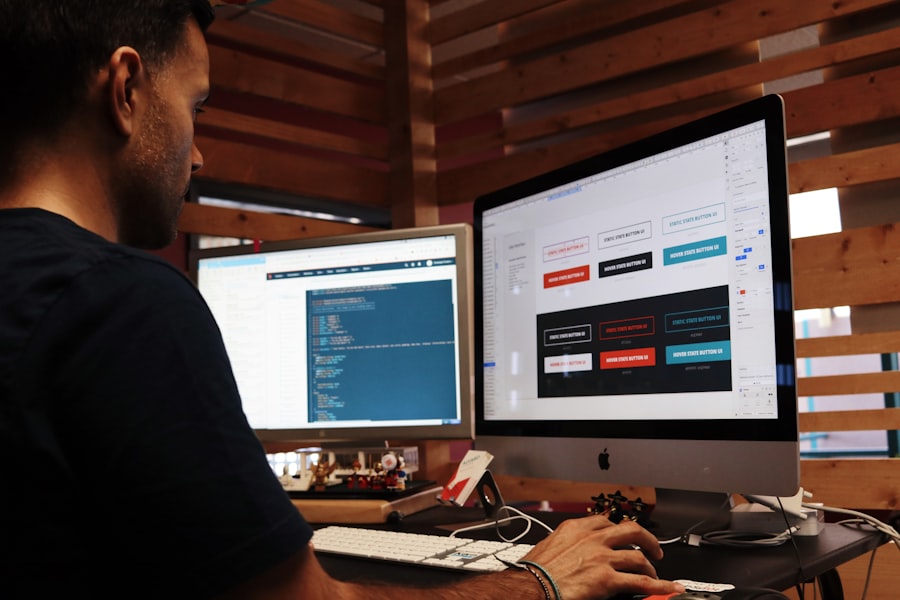
While UX is about how it works, visual design (UI – User Interface) is about how it looks and feels. A great-looking website can enhance trustworthiness, reinforce brand identity, and make the overall experience more enjoyable.
Aesthetics and Branding
Your website is a digital extension of your brand. Its visual appearance should align with your brand’s personality and values.
Colour Palette and Typography
Choose colours that evoke the right emotions and are accessible (good contrast). Select fonts that are legible and reflect your brand’s tone – professional, playful, modern, traditional. Stick to a limited number of fonts to maintain consistency.
Imagery and Iconography
High-quality, relevant images and icons can communicate messages quickly and break up large blocks of text. Ensure your imagery is consistent in style and quality, avoiding generic stock photos where possible.
White Space (Negative Space)
Don’t be afraid of empty areas on your page. White space improves readability, draws attention to important elements, and makes a design feel less cluttered and more sophisticated. It gives content room to breathe.
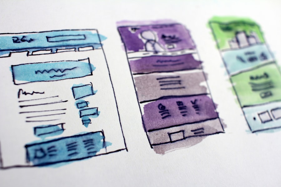
Visual Hierarchy: Guiding the Eye
Visual hierarchy is about arranging elements in a way that guides the user’s eye to the most important information first, and then to secondary information.
Size and Weight
Larger text, bolder fonts, and bigger elements naturally draw more attention. Use this to highlight headlines, calls to action, and key messages.
Contrast
Use contrasting colours and styles to differentiate elements. For example, a bright call-to-action button against a more subdued background will stand out far more.
Proximity and Alignment
Group related items together (proximity). Align elements consistently (e.g., left-aligned text, centralised images) to create a sense of order and professionalism.
Content Strategy: What You Say and How You Say It
Even the most beautiful and functional website is useless without good content. Content isn’t just text; it includes images, videos, and interactive elements. It’s what gives your website purpose.
Clear and Concise Copy
People scan, they don’t read every word. Your website copy needs to be digestible, to the point, and easy to understand.
Scannable Text
Use headings, subheadings, bullet points, and short paragraphs. Highlight key phrases. This allows users to quickly grasp the main points without having to read everything.
Benefit-Oriented Language
Instead of just listing features, explain how those features benefit the user. Focus on solving their problems or enhancing their lives.
Tone of Voice
Maintain a consistent tone of voice that aligns with your brand. Is it friendly, authoritative, playful, or informative? Let this guide all your written content.
Engaging Multimedia
Break up text with visuals and other content types to keep users engaged.
High-Quality Images and Videos
Relevant, high-resolution visuals can convey messages more effectively than text alone. Videos can explain complex concepts or tell a story in a compelling way.
Infographics and Data Visualisations
For data-heavy content, infographics make information much more accessible and engaging. They can turn dry statistics into easily understood insights.
Interactive Elements
Quizzes, calculators, polls, or dynamic maps can make your content more engaging and give users a reason to spend more time on your site.
If you’re looking to enhance your understanding of the fundamentals of creating engaging websites, you might find this article on the basics of web design particularly useful. It covers essential principles that can help both beginners and seasoned designers refine their skills. By exploring various design elements and user experience considerations, you’ll be better equipped to craft visually appealing and functional websites that resonate with users.
Performance and Accessibility: The Technical Underpinnings
| Aspect | Metric |
|---|---|
| Page Load Time | 3 seconds |
| Mobile Responsiveness | Yes |
| Browser Compatibility | Chrome, Firefox, Safari, Edge |
| SEO Friendly | Optimised |
| Accessibility | Compliant with WCAG 2.1 |
An engaging experience isn’t just about what you see; it’s also about what you don’t notice – like how quickly a page loads or whether everyone can use it. These technical aspects are fundamental to a positive user experience.
Website Speed: No One Likes Waiting
Slow websites are a major turn-off. Users expect pages to load almost instantly, especially on mobile. Every second counts.
Optimised Images
Large image files are a common culprit for slow loading times. Compress images without sacrificing quality and use appropriate formats (e.g., WebP).
Minified Code
Reduce the size of your HTML, CSS, and JavaScript files by removing unnecessary characters and comments. This shaves off precious milliseconds from load times.
Efficient Hosting
Choose a reliable web host that offers fast servers and good uptime. A cheap, slow host can undermine all your other optimisation efforts.
Accessibility: Designing for Everyone
Accessibility means ensuring your website can be used by the widest possible audience, including individuals with disabilities. This isn’t just good practice; it’s often a legal requirement.
Alternative Text for Images
Provide descriptive “alt text” tags for all images. Screen readers use this to describe images to visually impaired users, and it also helps with SEO if images don’t load.
Keyboard Navigation
Ensure your entire site can be navigated using just a keyboard (tab key, arrow keys, enter key). This is crucial for users who cannot use a mouse.
Colour Contrast
Use sufficient colour contrast between text and its background. Tools exist to check contrast ratios to ensure readability for users with varying visual impairments.
Clear Form Labels
All form fields should have clear, programmatically associated labels. This helps screen readers understand what information is required.
In conclusion, crafting an engaging online experience through web design is a multi-faceted discipline. It’s not about flashy graphics or the latest trends, but about a thoughtful, user-centred approach that combines a deep understanding of your audience with intuitive UX, appealing visual design, valuable content, and solid technical foundations. When all these elements come together, you create a digital space that truly serves its purpose and keeps users coming back. It’s a continuous process of learning, testing, and refining, but the reward is a website that effectively achieves its goals and genuinely connects with its visitors.